Garmin lock screen widgets: a great idea or just a distraction?
Would having fitness stats right on your phone's lock screen help keep you on top of your fitness, or be a waste of time?

A small but passionate debate is currently rumbling among users of Garmin watches: should the company develop widgets to show key fitness stats on your phone's lock screen, or does that defeat the whole point of your wearable?
First of all, I should note that the company hasn't hinted at any plans to add such widgets to its Garmin Connect app, so this is all hypothetical at this point. While it certainly does take input from its users seriously, and invites them to submit ideas to improve its products and services, it has to be choosy about what it implements, and even some popular suggestions (like the ability to track naps) may never make it into development.
The initial suggestion for lock screen widgets, from a Reddit user who has since deleted their account, suggested that they could be used to display key metrics such as recovery time, distance run that week, and remaining battery life. The poster owns a Whoop Band, whose app does exactly that, and finds it helpful to see the data at a glance without unlocking their device.
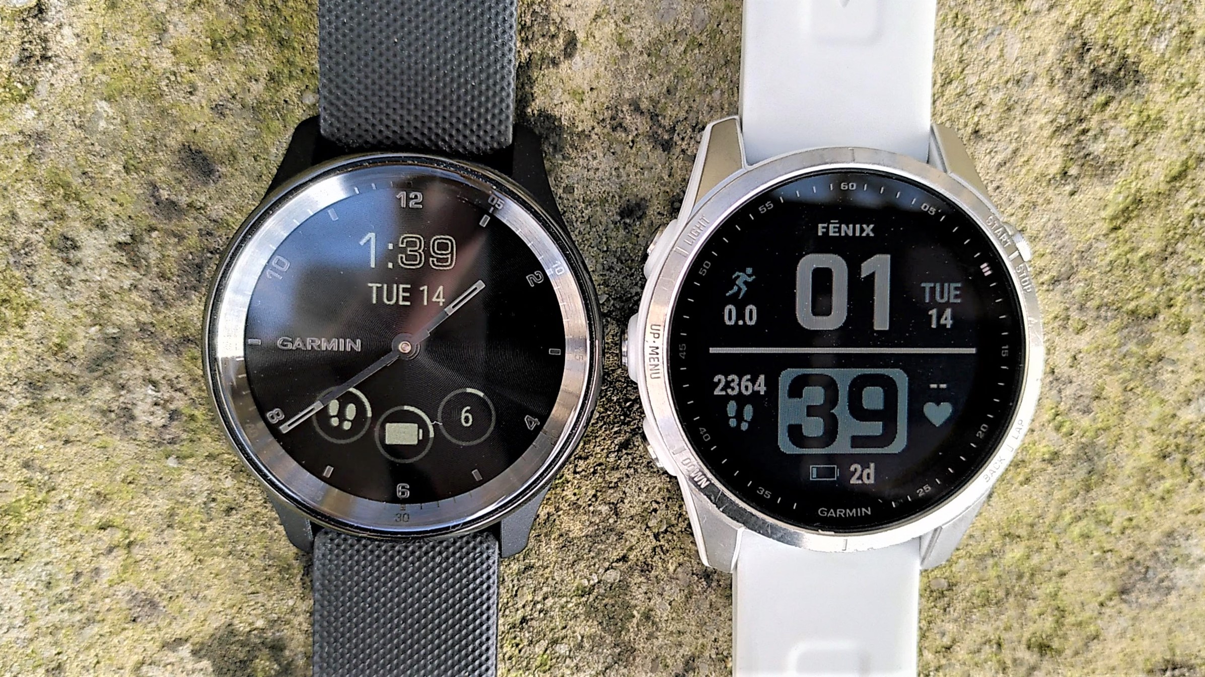
However, as many other users noted, most of that data is available right on the face of your Garmin watch – and if the particular stats you want to see aren't there as standard, you can easily download a custom watch face from the Garmin Connect IQ marketplace that includes them. Whoop is a different story; the band doesn't have a display of its own, so displaying stats on your phone's lock screen is the next best thing.

The original poster is perhaps a bit of a niche case, because they only wear their Garmin watch when they're training and opt for a regular analog watch the rest of the time, but I can still see their point.
If you own an Apple Watch, there's a tool called WidgetKit allows you to extend its display onto your phone or iPad, and Garmin lockscreen widgets could work in a similar way, perhaps showing the data you'd usually find by scrolling through your watch's Glances. Perhaps you might like to see the structure of your next planned workout, or a graph of your body battery over the last 24 hours.
I've recently started following a marathon plan with TrainingPeaks, and seeing the format of the day's training run on my phone's homescreen could definitely be handy to help me prepare and decide how long to allocate for it. You can't fit that onto a watch face without it looking super cluttered. It would be a major time and cash investment to develop, but I might join the original Reddit poster in making a feature request just in case.
Advnture Newsletter
All the latest inspiration, tips and guides to help you plan your next Advnture!
- Best GPS watches: the latest models from Apple, Garmin and more tested

Cat is Homes Editor at TechRadar and former editor of Advnture. She's been a journalist for 15 years, and cut her teeth on magazines before moving online. She helps readers choose the right tech for their home, get the best deals, and do more with their new devices.
